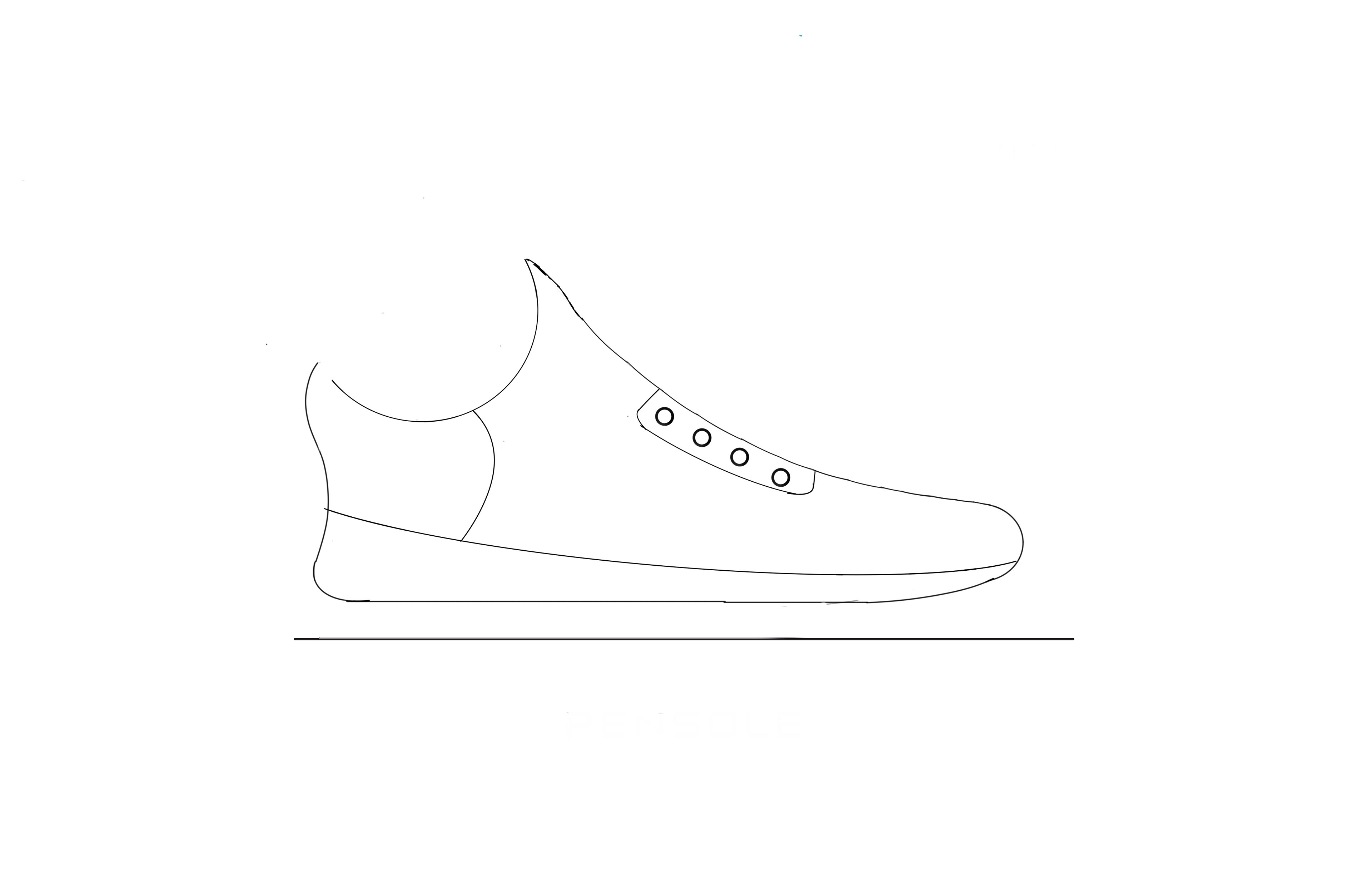
Started with preliminary digital sketch of how I wanted my shoe form to look.

One of the most iconic brands that also happens to be one of my favorite shoe brands is Adidas. I decided to use their brand as inspiration for this shoe design. My professor and I decided on this color way. I have always been a fan of of Japanese language so I added my name at the back of the shoe in Japanese. I decided to go with the trademark three stripe design for the side of the shoe.
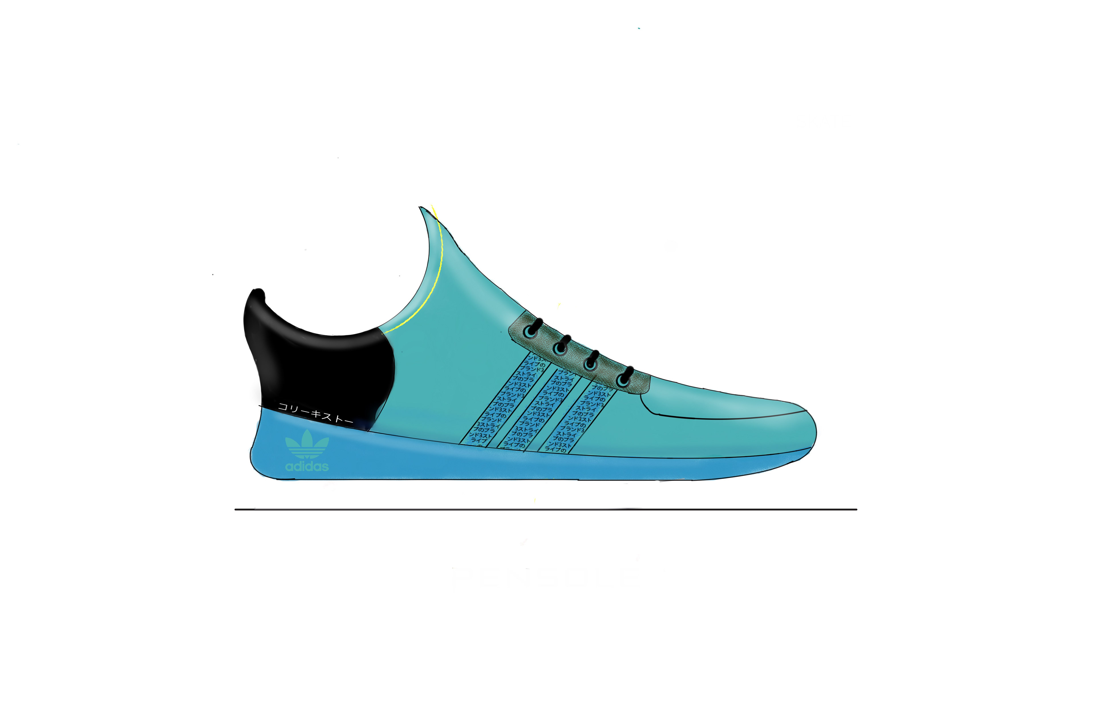
I didn't like how bare the three stripes on the side of the shoe looked so I went into those three stripes and decided to write, "The brand with three stripes" in Japanese as well. Added some highlights to make the shoe look more three dimensional and voila.

We were able to leave the shoe without a background or add one in. I decided to go with a background to give the entire project a more advertising feel to it. Upped the saturation a bit and added a drop shadow. This is my first shoe design and it is far from perfect. But, I will continue to keep working at it and plan on having more shoe design coming in 2018.